

Design & Trends, Kitchens in London
Top 2025 London ON Kitchen Colour Palettes: From Urban Chic to Rustic Charm
Jun
Finding the Perfect Hue to Reflect Your Style and Local Flair
As London, Ontario’s culinary spaces continue evolving, 2025 brings a fresh array of colour palettes that balance contemporary sensibilities with the city’s diverse architectural backdrops. Whether you live in a sleek downtown loft near Richmond Row or a cozy heritage home in Wortley Village, the right colour scheme can transform your kitchen into a cohesive, personalized haven. Below are six standout palettes—ranging from industrial-inspired neutrals to warm, farmhouse-inspired tones—designed to suit a variety of London lifestyles and design preferences.
1. Urban Industrial Neutrals: Charcoal, Slate, and Brushed Steel
Why It Works in London
With the revitalization of former factory buildings and warehouses along the Thames River, many inner-city condos and loft conversions lean into an industrial aesthetic. This palette taps into that vibe by pairing deep charcoal or slate gray walls and cabinetry with metallic accents and crisp white touches.
Key Elements
- Cabinetry & Walls: Matte charcoal upper cabinets paired with ash-gray lower units or an accent wall in slate blue-gray.
- Countertops & Backsplash: Polished white quartz with subtle veining, or honed concrete-look porcelain tile to echo loft flooring.
- Hardware & Fixtures: Brushed stainless-steel pulls, matte black faucets, and industrial-style pendant lights with exposed bulbs.
- Accents: Crisp white or pale dove-gray walls, plus a reclaimed wood floating shelf to soften the hardness of metal.
Local Inspiration
In the downtown area—around Dundas Place or Richmond Row—this colour story complements exposed brick, large steel-framed windows, and open floor plans. It delivers a sleek backdrop for stainless-steel appliances (e.g., a counter-depth fridge) and draws attention to architectural elements like concrete pillars.
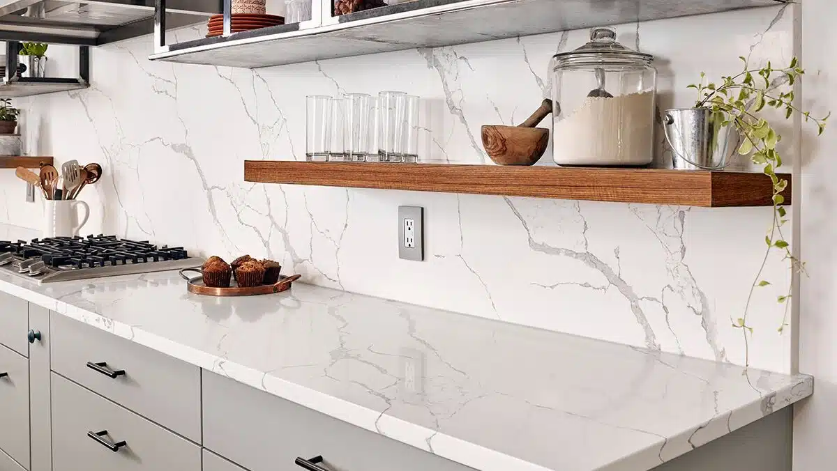
2. Soft Neutrals with Warm Wood Undertones
Why It Works in London
For those who love a timeless, Scandinavian-leaning approach—particularly in newer subdivisions around Riverside or Hyde Park—soft neutral tones infused with warm oak or maple accents create an airy, inviting atmosphere.
Key Elements
- Cabinetry & Walls: Off-white or light dove-gray cabinets with lower racking in natural oak or light maple. Walls painted in a pale greige (gray-beige) to reflect natural light streaming through south-facing windows.
- Countertops & Backsplash: Butcher-block island tops paired with honed quartz countertops in a subtle cream hue. Backsplash of elongated white subway tiles with light gray grout.
- Hardware & Fixtures: Brushed brass or satin nickel pulls; a simple, matte-black gooseneck faucet for a hint of contrast.
- Accents: Woven rattan seat stools, light linen window coverings, and minimal open shelving crafted from reclaimed lumber.
Local Inspiration
Homes in Westmount or the area near the University of Western Ontario often feature mid-century modern elements—flat planes, simple lines, and large windows. This palette accentuates those features by keeping colours light and layering in warm wood textures reminiscent of original hardwood floors.
3. Jewel-Toned Drama: Emerald, Sapphire, and Onyx
Why It Works in London
For heritage kitchens in Old East Village or South London bungalows, a bold, jewel-toned statement injects personality without feeling dated. Pairing deep blues, greens, or blacks with crisp white and gold accents honors the ornate details of early-20th-century millwork while feeling thoroughly modern.
Key Elements
- Cabinetry & Walls: Lower cabinets in emerald green or navy blue. Upper cabinets or pantry doors in matte black or very dark charcoal for drama. Walls remain in soft off-white to maintain brightness.
- Countertops & Backsplash: White marble (or marble-look quartz) countertops featuring subtle gray veining; backsplash of hexagon marble tile laid in classic honeycomb pattern.
- Hardware & Fixtures: Polished brass or brushed gold knobs and pulls; a matching brass bridge faucet or pot-filler to add warmth.
- Accents: Vintage-inspired Edison-bulb pendants with black or gold hardware; a stained-glass transom window above the sink if the home already has one.
Local Inspiration
Century homes in Wortley Village—with original coffered ceilings and pocket doors—are ideal canvases for this palette. The rich cabinet hues harmonize with original dark oak trim, and the metallic accents recall the period fixtures often found in local antique shops.
4. Pastel Mediterranean: Soft Sage, Terracotta, and Cream
Why It Works in London
A softer alternative to dramatic jewel tones, the pastel Mediterranean palette blends gentle greens, warm terracotta, and creamy whites, drawing inspiration from the European design flourishes found in older Stoneybrook or Byron streetscapes.
Key Elements
- Cabinetry & Walls: Base cabinets painted soft sage or pistachio green; walls in a warm cream or very pale peach.
- Countertops & Backsplash: Terrazzo-inspired countertops in a white base with flecks of rust, green, and gray. Backsplash of small terracotta hex tiles or handmade Spanish-style ceramic tiles.
- Hardware & Fixtures: Oil-rubbed bronze or matte black accents—simple cup pulls and spout-style faucets.
- Accents: Woven pendant lights in a seagrass or raffia texture; open shelving supported by wrought-iron brackets; potted herbs (rosemary, basil) on windowsills.
Local Inspiration
Quieter suburban neighbourhoods like Westdale, close to the University, often have bungalow homes with garden courtyards. This palette feels at home here by echoing the greenery outside and the warm brick facades common to mid-century local builds.
5. Earthy Rustic Neutrals: Taupe, Clay, and Moss
Why It Works in London
In rural-edge properties or older farmhouses in the north end—like near Lambeth or Hyde Park—an earthy, rustic approach resonates with the natural surroundings, from rolling fields to the Thames River valleys.
Key Elements
- Cabinetry & Walls: Cabinets in a muted taupe or greige; accent open cabinets or lower panels in a clay or terracotta shade. Walls are in soft moss green or a muted sage.
- Countertops & Backsplash: Soapstone or honed natural stone countertops in charcoal or slate. Backsplash of hand-hewn brick tiles or matte feldspar ceramic to add texture.
- Hardware & Fixtures: Oil-rubbed bronze or aged pewter pulls; farmhouse-style faucet in a dark finish with porcelain lever handles.
- Accents: Open cutting boards and utensil holders made from reclaimed barn wood; hand-forged metal brackets for shelves; woven jute or sisal area rugs near the sink.
Local Inspiration
Cottage-style homes near Medway Valley Heritage Forest or on the outskirts of Westminster often feature board-and-batten siding and exposed beams. This earthy palette inside keeps the connection to those natural vistas and rough-hewn architectural details.
6. High-Contrast Monochrome: Black, White, and Warm Grays
Why It Works in London
For modern infill constructions or renovated lofts in area like SoHo around Dundas and Wellington, a high-contrast monochrome palette reads as both crisp and spacious—ideal for small footprint kitchens in contemporary rowhouses.
Key Elements
- Cabinetry & Walls: Base cabinets in matte black; upper cabinets or open shelving in stark white. Walls painted in a warm light gray (e.g., greige with a hint of taupe).
- Countertops & Backsplash: White porcelain slab countertops (e.g., Silestone) with minimal veining; backsplash of large-format white or light gray tiles with black grout for graphic impact.
- Hardware & Fixtures: Matte black pulls and faucets to coordinate with cabinetry. Under-cabinet LED strip lighting in cool white ensures visibility.
- Accents: Open metal shelving in black steel; minimalist pendant lights in matte black; potted succulents in white planters to soften the overall palette.
Local Inspiration
Contemporary infill homes near London’s Warehouse District often feature polished concrete floors and steel-framed windows. This monochrome palette mirrors those industrial finishes while injecting warmth via carefully chosen gray undertones to avoid feeling too stark.
Final Thoughts: Choosing the Right Palette for Your Lifestyle
London, Ontario’s 2025 kitchen colour trends celebrate both the city’s new urban developments and its storied neighbourhoods. Whether you gravitate toward industrial-influenced grays downtown or an earthy, farmhouse-inspired clay palette in the suburbs, the key is to:
- Consider Your Home’s Architecture: Match cabinet colours and finishes to existing hardwood tones, brickwork, or moldings to ensure cohesion.
- Balance Light and Contrast: In smaller kitchens—especially in rowhomes or condos—lean on lighter neutrals to open up space, then layer in darker accents for depth.
- Incorporate Local Influences: Draw inspiration from London’s nearby Green Spaces, heritage districts, or modern infill projects to create a kitchen that feels rooted in place.
- Layer Textures: Even a monochrome palette can feel warm when you mix matte cabinet finishes, textured backsplash materials, and varied metal accents.
- Test Before Committing: Sample large paint swatches and order cabinetry door samples so you can view colours at different times of day—morning sun in Byron may cast a different hue than afternoon light in South London.
By selecting a colour scheme that honors your personal style and London’s unique neighbourhood character, you’ll create a kitchen that’s not only on-trend for 2025 but also deeply connected to the place you call home.

